
Colour Trends: 4 Colour Palettes of 2020

The Colour Trends that will define the new decade.
Towards a more Conscious Living
We live in a time where we think we are never doing enough. We should work more, earn more, socialise more, workout more, eat better, read more. Most of us can’t help but comparing ourselves to others, thinking they are doing so much better than us. But that is because we see it through the lens of social media!
Entrenched in the digital age, we struggle to try and meet society’s expectations. From this is growing an appreciation of the importance of personal wellbeing as well as the health of the planet. We are seeking greater connection to the natural world, deriving comfort from nostalgia and enjoying a degree of escapism, as a way to balance it all out.
‘These colour trends are influenced by what’s happening in the world around us. […]With more focus on mental health, the wellness movement continues to gain momentum, as does an emphasis on natural materiality.’ Andrea Lucena-Orr, Dulux Colour and Communications Manager says of the 2020 forecast.
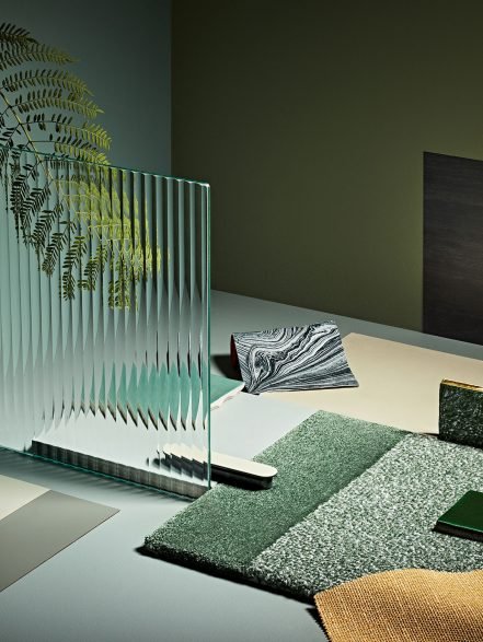
The key palettes: Cultivate, Comeback, Grounded and Indulge represent the essence of current social trends and global movements. Each colour palette, in their own way, are a reflection of our desire to connect with nature, feel grounded and be more self aware.
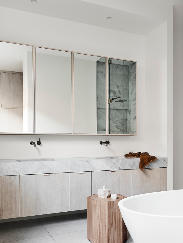
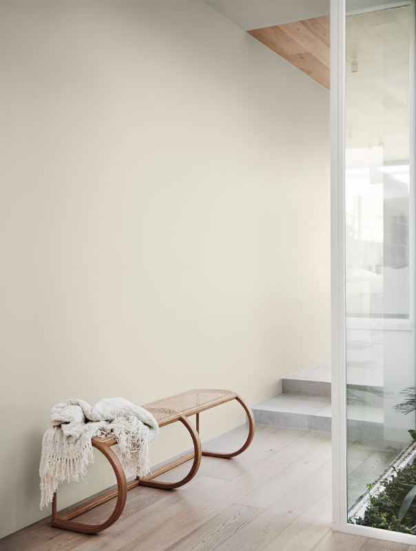
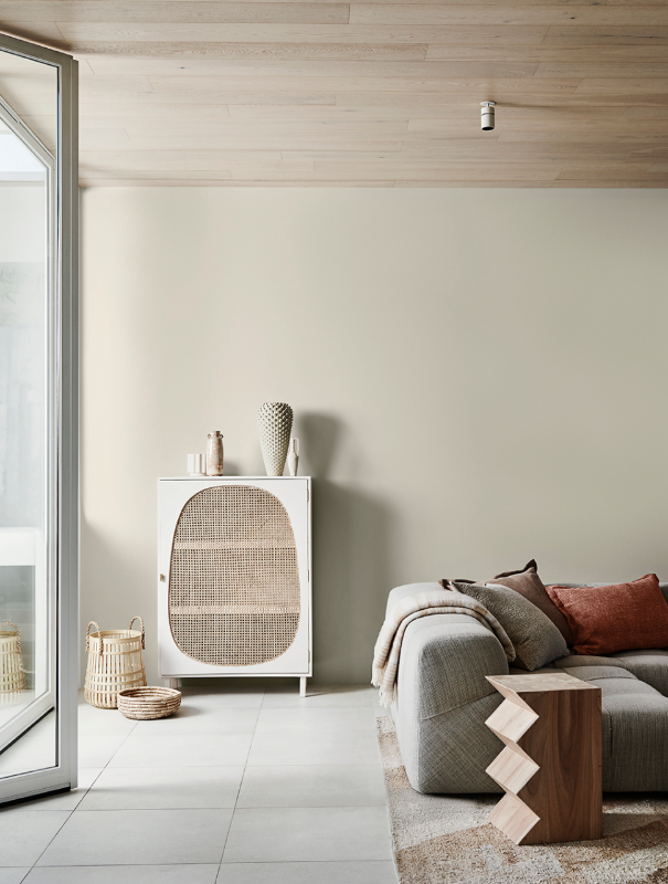
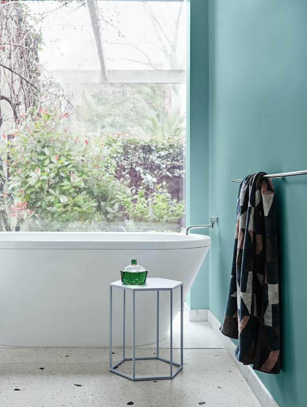
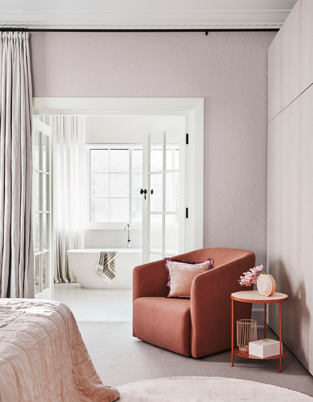
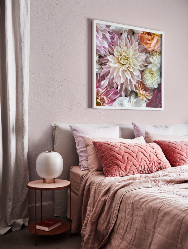
Colour Trend 1: Grounded
Keywords: Simple, beautiful, uncomplicated, less is more, natural, raw, textures, comfort, longevity, craftsmanship
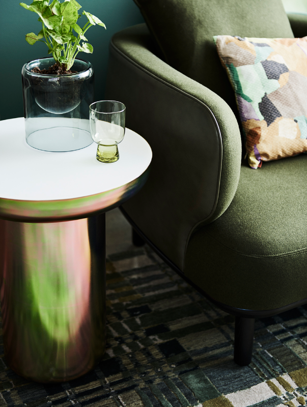
Grounded is for the one going towards conscious, smart living. Neutral colours and natural materials contrast with minimal, carefully chosen homewares for an uncluttered look. The key here is texture, such a natural colour scheme can only come to life if you add texture and materiality to it. It is perfect for vintage items, time-worn textiles as well as more contemporary ceramics and artwork.
This colour trend is my personal favourite!
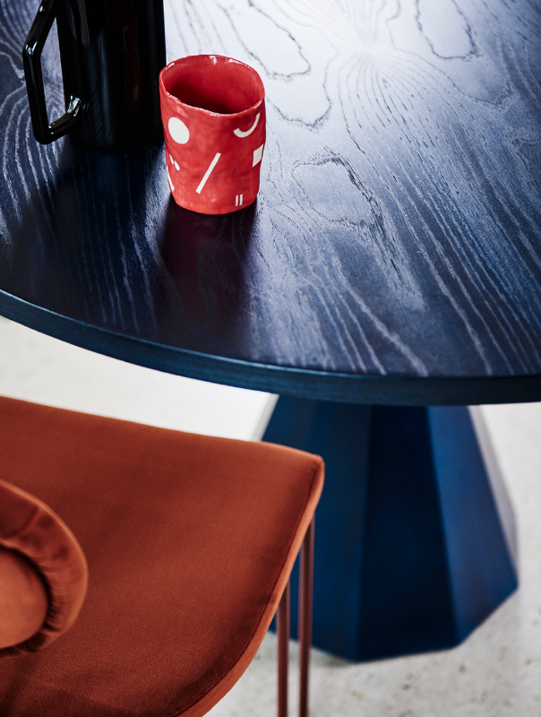
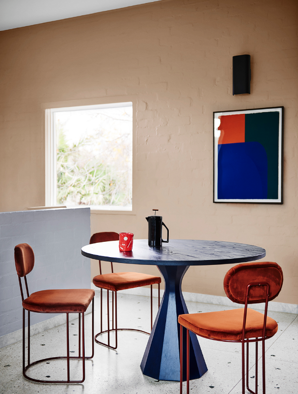
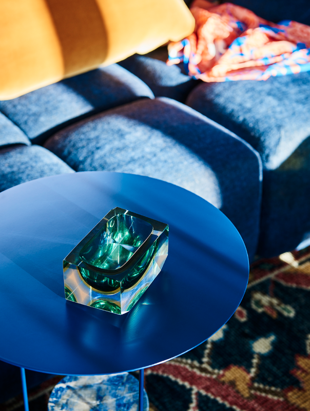
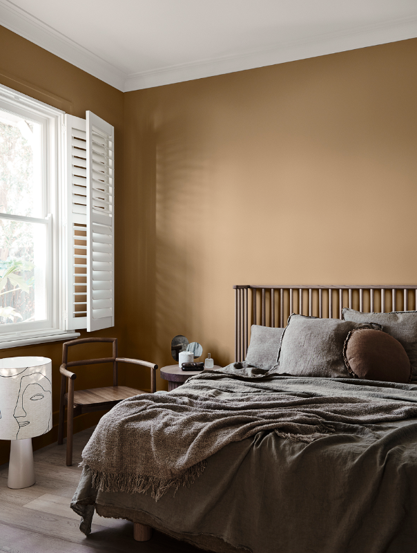
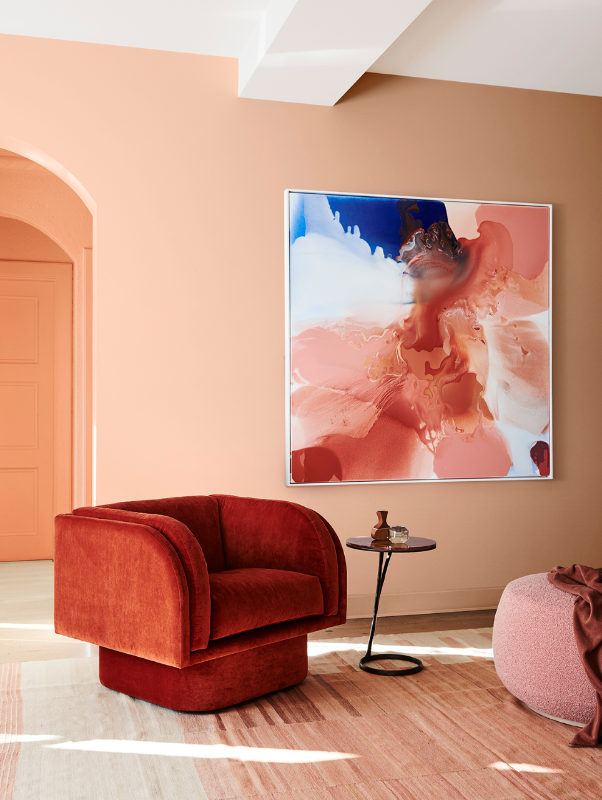
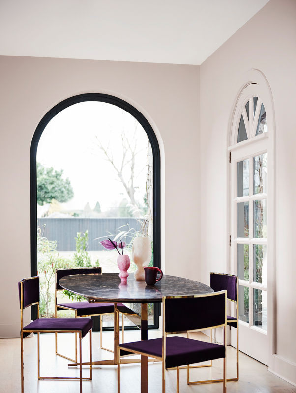
Colour Trend 2: Comeback
Keywords: eclectic, vintage, bold, retro, creative, classic, familiar, warm, elegant
This palette is bold, warm and playful yet classic and elegant. Blues dominate the palette and help create a calming peaceful environment. The warm reds and oranges give it energy and what I call a bit of “oomph”. Comeback has quite a retro vibe and works really well with vintage design pieces from the 20’s to 50’s or fun 80’s pieces, you choose! This is a great colour scheme for recycled/upcycled and vintage furniture.
The one thing I always say to clients is to stick to neutral tones for wall and joinery. Then, add the colours with homewares, furniture, and potentially one feature wall. So if you consider painting your walls or re-designing your kitchen, make sure you choose a colour you have always loved rather than one you’ve just discovered. Avoiding the trends and sticking to your style will ensure you don’t regret your decision in a year from now!
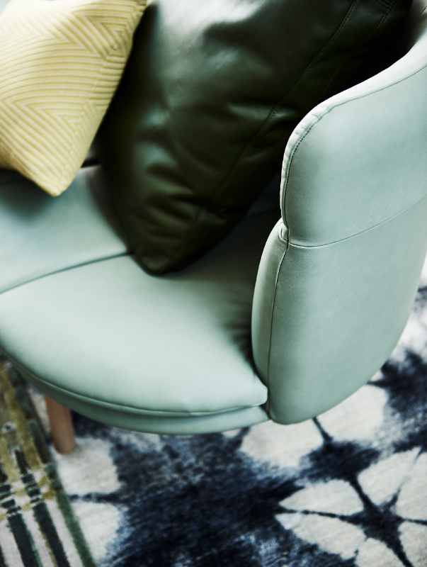
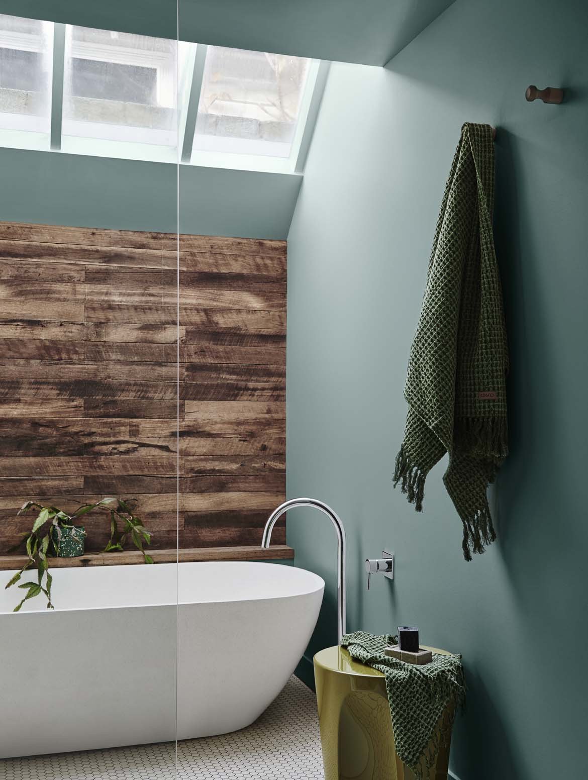
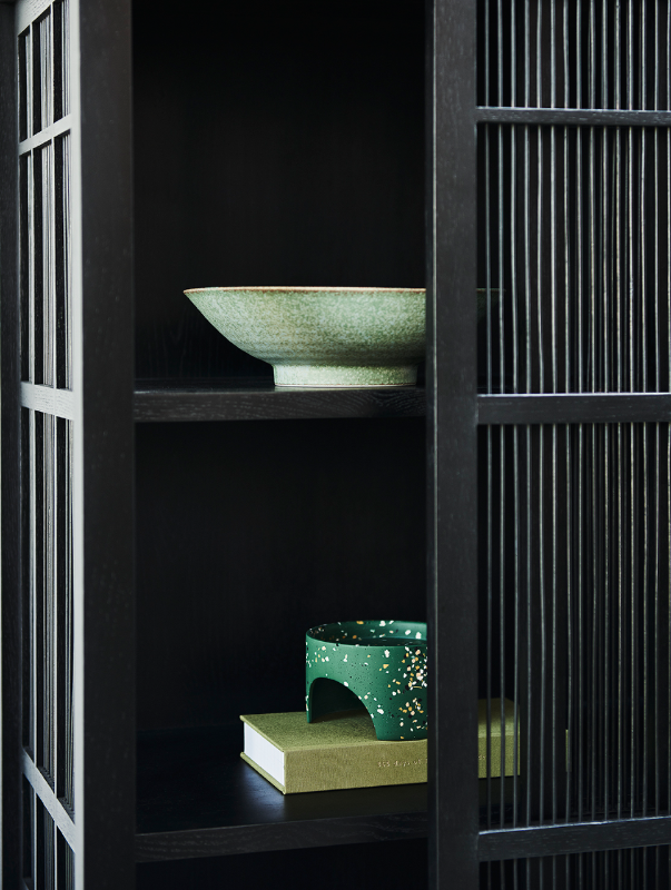
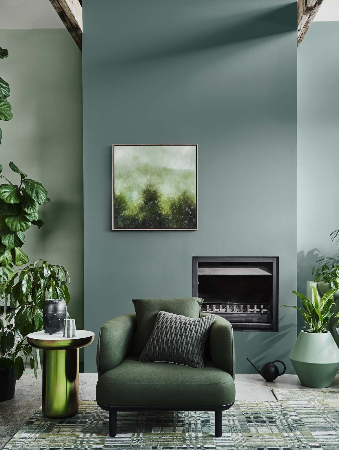
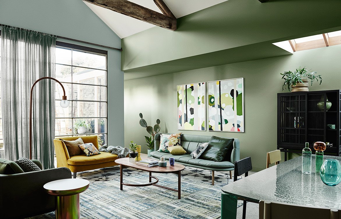
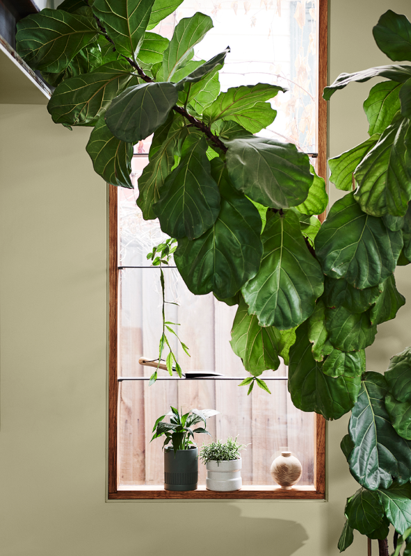
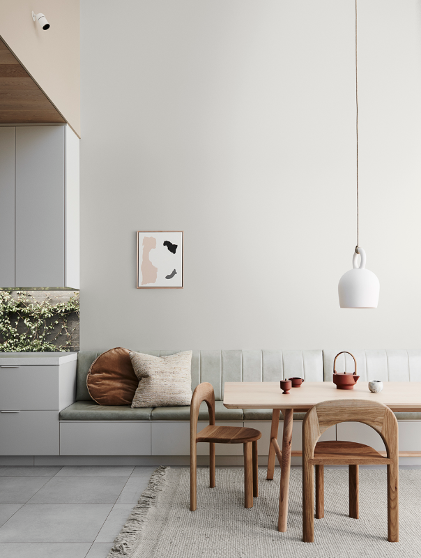
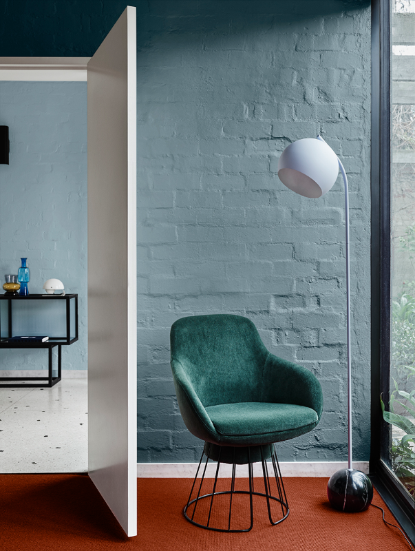
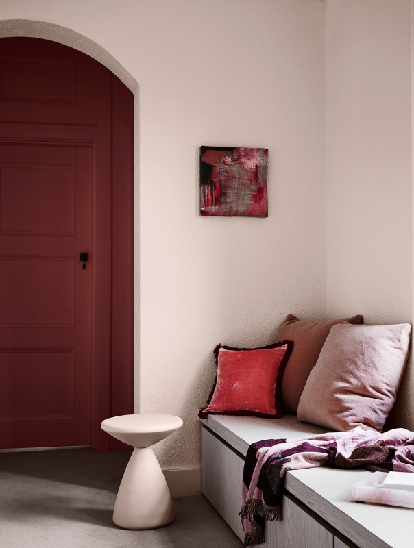
Colour Trend 3: Cultivate
Keywords: nurture, regenerate, escape, disconnect, nature, light
If you want to escape the crush of city living and create a calming sanctuary, Cultivate is the palette for you.
Cultivate personal growth, inspiration, slow living and rejuvenation by surrounding yourself with calm and gentle layers of greens that will reinforce your connection with nature.
The palette is an ode to the small simple pleasures in life. It works beautifully with Japanese inspired designs, Feng Shui principles and minimalism. The soothing greens can be offset with enlivening plum colours and uplifting yellows for a more energetic atmosphere.
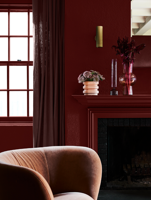
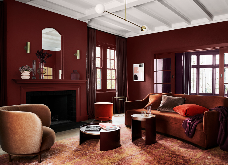
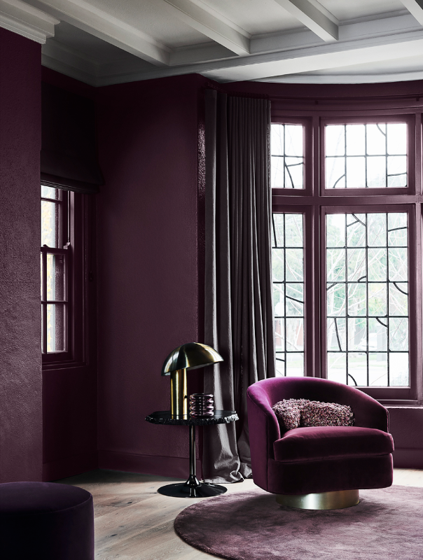
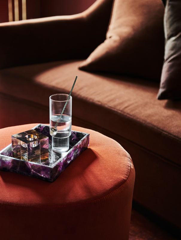
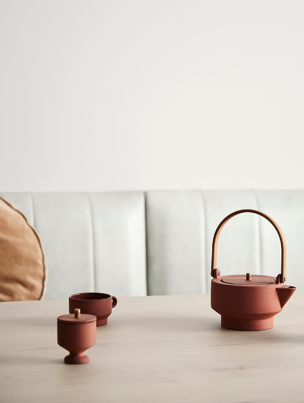
Colour Trend 4: Indulge
Keywords: Luxurious, warm, rich, soft, sophistication, curves, retro, romance
One other way to escape from the busy life we live and the pressure we are constantly under is to feel love. Who wouldn’t want to go home to a cosy, warm atmosphere made of rich dark colours and soft textures that scream romance.
What I love about Indulge is that you can go dark and get that intimate & romantic retro Parisian escape feel or you can go with a lighter palette that feels cosy and comforting whilst being bright and playful.
This is a great palette if you are going for a bit of an art deco style or a retro futuristic 70’s look.
PIN ME & SAVE ME FOR LATER!
I love seeing that Interior Design is slowly working its way towards sustainable and mindful living, with a genuine concern for wellbeing. I cannot wait to see what 2020 produces and how brands and designers will implement this forecast into their work.
If you are interested in mindful living and ways to make your home more 'zen', my post on ways to transform your home into a sanctuary is a must read!
What are your thoughts on these colour trends? Are you one step ahead or do you plan on renovating taking inspiration from one of these palettes? Let me know in the comments! I’d love to get your opinion on it.
Styling by Bree Leech, photography by Lisa Cohen
Find the full 2020 Forecast at Dulux